In our OTS we used simple white writing fonts, we didn't want to use fancy or cheap looking fonts that would either take the eye off of the opening title sequence and be off putting so people didn't know where to look. We also didn't want to use bright colours or different size and shape fonts that would make our OTS look cheaply made and not good quality.
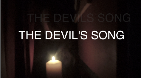
Our main title 'The Devils Song' we used a font called cross dissolve, this font was big and bold and had after a few seconds the writing floated at faded upwards. We as a group used this font as we thought it looked and represented the characteristics of a ghost. This meant it fitted our opening title sequence well. After adding the font and trying it we thought it fitted well and looked appealing.
Below you can see the fonts in different steps and how it disappears upwards.
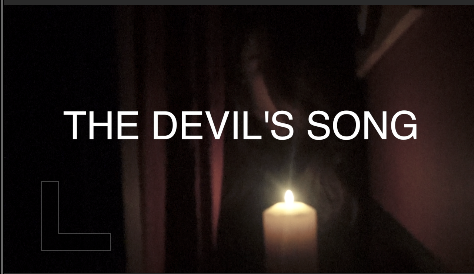
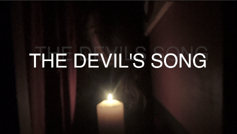
These three images show the title moving at different times so you can see the 'ghost; effect moving up and getting lighter as it goes a long.
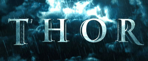
The closest looking title we could find was 'Thor' however this film is not a horror film. This made our title completely unique as it is not like any other film title. We tried a few different font but decided this one was the best matched to our OTS.
